Monday 27 July 2015


What are static and dynamic websites?

There are many static websites on the Internet, you won’t be able to tell immediately if it is static, but the chances are, if the site looks basic and is for a smaller company, and simply delivers information without any bells and whistles, it could be a static website. Static websites can only really be updated by someone with a knowledge of website development. Static websites are the cheapest to develop and host, and many smaller companies still use these to get a web presence. Here at Soft Cybernet web development, we can advise or help to develop both static and dynamic websites.

Advantages of static websites

· Quick to develop
· Cheap to develop
· Cheap to host

Disadvantages of static websites
· Requires web development expertise to update site
· Site not as useful for the user
· Content can get stagnant

Dynamic sites on the other hand can be more expensive to develop initially, but the advantages are numerous. At a basic level, a dynamic website can give the website owner the ability to simply update and add new content to the site. For example, news and events could be posted to the site through a simple browser interface. Dynamic features of a site are only limited by imagination. Some examples of dynamic website features could be: content management system, e-commerce system, bulletin / discussion boards, intranet or extra net facilities, ability for clients or users to upload documents, ability for administrators or users to create content or add information to a site (dynamic publishing).

Advantages of dynamic websites
· Much more functional website
· Much easier to update
· New content brings people back to the site and helps in the search engines
· Can work as a system to allow staff or users to collaborate

Disadvantages of dynamic websites
· Slower / more expensive to develop
· Hosting costs a little more

Summary
Many sites from the last decade are static, but more and more people are realizing the advantages of having a dynamic website. Dynamic websites can make the most of your site and either use it as a tool or create a professional, interesting experience for your visitors.

This article aimed to tackle some of the questions faced by website owners. If you'd like to comment on this article or have any questions, please  contact us.


Our Website is Soft Cybernet.
We provide services such as seo services
web design services
ecommerce website designing services
smo services
online reputation management services
psd to html and css conversion services
banner design services
you can email us on info@softcybernet.com

Sunday 24 May 2015

Like the phrase ‘beauty is in the eye of the beholder’, effective web design is judged by the users of the website and not the website owners. There are many factors that affect the usability of a website, and it is not just about form (how good it looks), but also function (how easy is it to use).

Websites that are not well designed tend to perform poorly and have sub-optimal Google Analytics metrics (e.g. high bounce rates, low time on site, low pages per visit and low conversions). So what makes good web design? Below we explore the top 10 web design principles that will make your website aesthetically pleasing, easy to use, engaging, and effective.

1. PURPOSE

Good web design always caters to the needs of the user. Are your web visitors looking for information, entertainment, some type of interaction, or to transact with your business? Each page of your website needs to have a clear purpose, and to fulfill a specific need for your website users in the most effective way possible.

2. COMMUNICATION

People on the web tend to want information quickly, so it is important to communicate clearly, and make your information easy to read and digest. Some effective tactics to include in your web design include: organising information using headlines and sub headlines, using bullet points instead of long windy sentences, and cutting the waffle.

3. TYPEFACES

In general, Sans Serif fonts such as Arial and Verdana are easier to read online (Sans Serif fonts are contemporary looking fonts without decorative finishes). The ideal font size for reading easily online is 16px and stick to a maximum of 3 typefaces in a maximum of 3 point sizes to keep your design streamlined.

4. COLOURS

A well thought out colour palette can go a long way to enhance the user experience. Complementary colours create balance and harmony. Using contrasting colours for the text and background will make reading easier on the eye. Vibrant colours create emotion and should be used sparingly (e.g. for buttons and call to actions). Last but not least, white space/ negative space is very effective at giving your website a modern and uncluttered look.

5. IMAGES

A picture can speak a thousand words, and choosing the right images for your website can help with brand positioning and connecting with your target audience. If you don’t have high quality professional photos on hand, consider purchasing stock photos to lift the look of your website. Also consider using infographics, videos and graphics as these can be much more effective at communicating than even the most well written piece of text.

6. NAVIGATION

Navigation is about how easy it is for people to take action and move around your website. Some tactics for effective navigation include a logical page hierarchy, using bread crumbs, designing clickable buttons, and following the ‘three click rule’ which means users will be able to find the information they are looking for within three clicks.

7. GRID BASED LAYOUTS

Placing content randomly on your web page can end up with a haphazard appearance that is messy. Grid based layouts arrange content into sections, columns and boxes that line up and feel balanced, which leads to a better looking website design.

8. “F” PATTERN DESIGN

Eye tracking studies have identified that people scan computer screens in an “F” pattern. Most of what people see is in the top and left of the screen and the right side of the screen is rarely seen. Rather than trying to force the viewer’s visual flow, effectively designed websites will work with a reader’s natural behaviour and display information in order of importance (left to right, and top to bottom).

9. LOAD TIME

Everybody hates a website that takes ages to load.  Tips to make page load times more effective include optimising image sizes (size and scale), combining code into a central CSS or JavaScript file (this reduces HTTP requests) and minify HTML, CSS, JavaScript (compressed to speed up their load time).

10: MOBILE FRIENDLY

It is now commonplace to access websites from multiple devices with multiple screen sizes, so it is important to consider if your website is mobile friendly. If your website is not mobile friendly, you can either rebuild it in a responsive layout (this means your website will adjust to different screen widths) or you can build a dedicated mobile site (a separate website optimised specifically for mobile users).


It is easy to create a beautiful and functional website, simply by keeping these design elements in mind. Have you got a website design that needs reviewing or optimising? Or perhaps, you are planning a website and you are looking to get the design right from the ground up. Either way, these principles of effective web design can help your website be more engaging, useful, and memorable for visitors

Tuesday 19 May 2015

The overall working of link building is now being questioned with Google’s John Mueller, himself, signalling to lessen the focus on link building to avoid harm for your website. He says that he would try to avoid link building when considering SEO for a website.
Until very recently, link building was referred to as a crucial part of any SEO campaign. With Google itself, considering a rich link profile as a major signal for the domain’s authority, it was the only sensible way to increase the authority of a website. However, of late Google seems to be attacking the practice of link building with new regulations and algorithmic updates closely monitoring the link profile of a website. These are signals to search marketers to avoid the practice of link building.
There are mixed responses to the question that whether link building should be completely banned or is it still a viable strategy to a certain extent. Links have the heaviest effect on the algorithm as it is the most practical element to determine the authority of the site, however over some time the impact has weakened due to the increased risks involved in it.
web design services in hyderabadImage Courtesy: Clicktechtips.com
1) Mobile Optimization: From 21st April, it has become more important for websites to be optimized for mobiles, following the “Mobilegeddon” update. You simply can’t afford to consider this factor in your SEO strategy, and Google has been for a long time keeping a check on all the mobile-optimized sites to rank them higher. Your site gets more visibility on search if it is optimized for mobile, no matter which device it is. Not integrating mobile-optimization into your SEO, may result into loss of some valuable rankings.
2) Seasonal SEO: One more trend that is becoming increasingly important in 2015 is SEO. Rather than looking up at web pages as finished products, look upon it to optimize to fit to the audience’s needs at various time of a year. If you have a “Spring Sale” promoted on your website, and don’t bother to move down the offer until Christmas, it is definitely not going to create a good image for your website site.
Also, ensure that the audience’s needs are addressed at various intervals during the year. So, if you have the Haloween lined up in a few weeks, ensure that you are promoting the special offer across the website. Make the page more relevant for your audience by optimizing it for festivals will increase the rankings and attract more audience to your website. A good user experience will result into more shares and brand advocacy, which in turn will get increased traffic.
3) Content That Is Informative and of At Least 1000 Words for Blogs/Webpages: Every page on your website should be descriptive and informational and of at least 100 words in length, so that each time a visitor lands up on any page of your website, they get their desired information.
Your content will immediately establish your authority and your grip over the industry. Even if it is an About Us page or a Contact Us page, do not underestimate their power and provide accurate information in detail wherever needed.
If you feel that link building is still a lucrative option to a certain extent, you are right. However, the most legitimate way to create backlinks is by writing great content on-site and off-site. This is the surest way to get quality links as people would like to share a premium content that is meant for them. The content could be in text, or infographic, or a video, but it should be like a linkable asset. Content is the ultimate tool to your link building efforts that are legitimate.
4) Get Product Reviews: This is one of the best online brand building tool, in addition to being a lucrative SEO element. Product reviews tend to bring the best visitors to your website and could prove to refer some profitable prospects.
You could utilize the existing positive customer feedback, or reviews and post them on your websites, or other review sites. Also, you could send a sample of your product or offer a slice of your service for free to a review blogger, and have them write reviews on them.
5) Strong Social Media Presence: If you want to become social, you will need to get involved with the prospects. Create business profile on all the social networking platforms where you are likely to get relevant people and engage regularly on these platforms by coming up with frequent posts. Work towards building contacts, connections, and an on-going community with syndicated content and company updates with some exclusive offers.
6) Brand Mentions: Similar to how Google used to view inbound links, it also monitor the brand mentions throughout the web. There is almost no risk involved in getting brand mentions. They pass authority based on the trustworthiness of the source and the context of the brand mention.
7) Navigation Of The Site: You will seem to be good to Google if you give importance to user-experience by making it easy for the visitors to navigate around your site. Optimize the navigation to make it the best site that the users could move around. The best practice is to group the pages in a single, minimalist navigation bar with well-defined headings and a complete list of pages underneath. Also include a search bar and have a systematic inter-linking system to ensure that all the pages on your website are easily reachable.
Conclusion:
With link building becoming infamous, your first priority should be to focus on these SEO techniques. There are numerous other ranking factors other than link building that could be considered. These practices will not only help you in ranking, but also help you in building a dependable brand.

Sunday 17 May 2015

web design services in hyderabad
How to Increase Alexa Site Linking or Increase Alexa Site Backlinks trick is very useful for Increase Alexa Rank for your websites, So most are are need Increase sites linking in Alexa, if you wanna best Alexa rank fast, then first you must try to get more Alexa backlinks or Linking. Now SEO is taking the biggest place of Blogging, because Google update time to time new Google algorithm update for giving sire ranking in the search result, If you don’t know right link building strategy then Google can down your site easily, Means Google algorithm update like Panda, penguin updates can directly affect your site. So always caring and always trying to confirm any method of link building for safety, and make your blog Google-friendly.
Making backlinks is not hard, You can build backlinks or site Linking very easily by commenting on another blog, guest posting, article Submission. Social bookmarking, Blogging Communities,  and also many other similar ways, All backlinks very important, Similar like as give more popularity. You must get more site linking, to attract more advertising and get more value of your blog.

Monday 11 May 2015


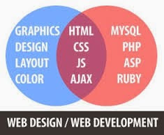
Many people use these two terms “web designing” and “web development” separately, but they really do have two different meanings. If you’re looking for a new job in web designing & web development or someone to build your website, you need to know the difference.
web design services in hyderabad
Web Designing
Web designing is the customer-facing part of the website. A web designer is concerned with how a site looks and how the customers interact with it. Good web designers know how to put together the principles of design to create a site that looks great.
They also understand about usability and how to create a site that customers want to navigate around in because it’s so easy to do. Here the designers use Graphics, Design, layout, color, etc, to design a good and attractive websites.
Web Development
Web development is the back-end of the website, the programming and interactions on the pages. A web developer focuses on how a site works and how the customers get things done on it. Good web developers know how to program CGI and scripts like PHP, Asp.net, JSP, etc. They understand about how web forms work and can keep a site running effectively.
Most People Blur the Lines
I have never met a web designer who knew absolutely no JavaScript, PHP, or HTML. And I've never met a developer who wasn't aware of the importance of design to a website.
But when you apply for a job or look for someone to work on your site, you need to know what you’re looking for — web design or web development. Even if you can do or hire someone to do both jobs, knowing the difference is key to getting the job done.

If you are looking for web designing company to design responsive and attractive websites you can visit Soft Cybernet

Saturday 9 May 2015

When someone uses a search engine, they type in one or more words describing what they are looking for: 'Soft Cybernet' or 'Web Designing Services', for example. These words or phrases are known as keywords.

The search engine then comes back with a list of web pages, with content that relates to the keyword used.

So if you are building a business website, you want to ensure that when customers search for relevant keywords, your website appears as early as possible in the list of results. That is what search engine optimization (SEO) is all about.

So how can I use keywords on my business website?

At a basic level, you want to use relevant keywords in your content. In fact, you may want to identify keywords first and then create content built around these. There are three things you need to remember.

Concentrate your efforts on keywords likely to be used by potential customers focus your individual web pages - target just a few keywords per page take into account what the competition are doing
Choosing the right keywords

As far as useful keywords are concerned, you need to think the way potential customers are likely to think For example, suppose you have developed an amazing new Digital Marketing services such as seo. You could use that a keyword for one of  your web pages, making it clear that the page is about seo.

But that's not what potential customers will be searching for - in fact, they may not even know it exists. They'll be looking for 'seo services' or 'seo services in hyderabad'. so those are the sort of keywords you should be thinking of using.

Focusing your efforts

You should aim to create individual web pages that are clearly relevant for just a handful of keywords. Simply stuffing every keyword you can think of into your content doesn't work - you end up with poor quality content, and may well find your web pages are penalised by search engines if they think you're trying to cheat the system.

Beating the competition

All your competitors are doing SEO on their websites too - and some may have bigger budgets than you. Trying to compete for single keywords is probably hopeless (and less likely to deliver customers who are interested in what you specifically have to offer).

Instead, look for longer phrases that closely match what your target market want, and where you have a competitive edge.

Monday 27 April 2015

Soft Cybernet


You may be wondering about the difference between a website and a blog. Should you start with a website or blog? Is one better than other? Do you need both?

Blogs are typically best for sites that are news-oriented. Meaning there is no specific order to the content, and you will be publishing the "thought of the day" in regards to your blog's topic or theme.

So let's say your blog is about Digital Marketing and you have categories on your blog such as web designing, search engine optimization (SEO), Online Reputation Management, Social Media Optimization, Link Building, etc. Every time you have something new to write, you will publish a new post and the latest will appear at the top of your blog, while the older posts move down (off) the page into your archives.

Notice my blog, http://www.softcybernet.blogspot.com The content is usually pretty current (see the date) and there post is always at the top of the page, and you can search my posts by category.

Conversely, look at my website, http://www.softcybernet.com Websites are more "static" meaning the content is not dynamically published by date, category, etc. With a website, you have more control over the organization of your content (in general).

If you are creating a tutorial-based site, where the steps/information need to be presented in a certain order then a website is often the better choice.

Now, this is not to say you cannot create static pages on a blog, You absolutely can. However, with websites, it's easier to organize your pages and place them where you want within the site navigarion.

So depending on how you want to present your content, you should think carefully about which method is best for your needs.

I had a friend tell me that he was reading a blog and found it very confusing because he couldn't find the information he was looking for. The blog owner didn't do a very good job of organizing his "important posts". Many of them were buried in the archives since blogs typically display newer content first.

He could remedy this by creating a website instead of a blog or use more "static" pages on his blog that never get buried (yes, this is possible). But many bloggers don't take the time to learn how to do this so often their blogs become difficult to navigate.

Be sure you think how you want your content organized before jumping into creating a blog. You may find that a website is better for your needs.